
Juju: a logo with a story
by Marcus Haslam on 3 November 2011
Mark Shuttleworth’s keynote this week at the Ubuntu Developer Summit includes introducing Juju, including a big slide showing off the new Juju logo. Below is the story of how that logo it came into being. The Juju project is done. We asked the Juju community to help, and out of out of love for the brand they responded:

Juju was finally released to all the Dev-Ops out there, and so it’s time for a little look back on how the Juju logo come into being. Four months ago in the middle of July 2011 the Design Team received a request for some help with a new logo. This was for a project what was just on the edge of the RADAR and nobody was quite sure how big it would get!


Abi R had a number of ideas for logos, the most interesting where the wavey “magic carpet” designs. After that Robbie introduces some ideas around the letter ‘e’ as the project has still called Ensemble at the time, and Abi had a couple of further goes at developing that into a cuboid concept to go with the atoms. These all got collected up and attached to the bug report that you can read.

Ensemble was about to get a rebrand, to become Juju. Juju is a west-African system of beliefs, and has the ‘u’ sound much more akin to the other ‘Ubuntu’ and “Unity’ words that the family projects working within Ubuntu tend to get. This is when the call went out to the Design blog for some new ideas. Martin Owens did a sun/shield design making use of the circle concept seen in the Ubuntu Circle of Friends, and the other suggestion from “Birdy” was for a concept around a flying bird.

Mark Shuttleworth also suggested something around the topic of “connections”. So with everything in the basket, from Flying Carpets to Flying birds when it was time to sit down and play with the designs. What you can see here is the first concept presented to Mark for review.
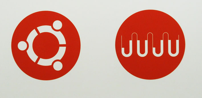
This didn’t really have the “connections” aspects (Juju is about magically plugging components together to semi-automatically build a bigger system). The other things that didn’t seem to work was the dots on the ‘j’s in the word ‘juju’, so what you see is a slightly modified version of the Ubuntu Font Family. There’s the circle, there’s the connections, and also the Canonical/Ubuntu “dots” at the joins. It’s spells “juju” in the logo if you unwrap it in the right way, and spells “WW” in morse code!


After all Juju can only do two thirds of the server configuration site to make a website for you, you still have to do the other third! Thanks all for the juju designs. I hope you’ve enjoyed reading about this as much as I enjoyed trying to put everyone’s ideas together into one pot.
To read more about Juju visit juju.ubuntu.com and learn how you can ‘charm’ even the largest cloud or cluster deployments.